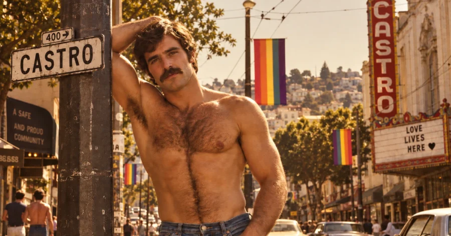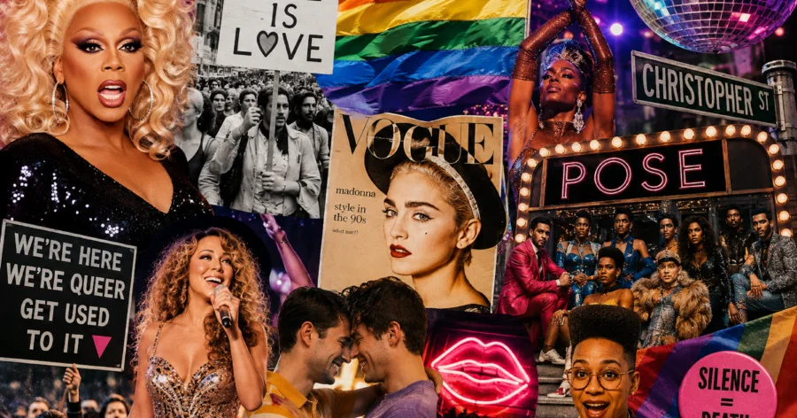
Few symbols are as instantly recognisable as the rainbow flag. From Pride marches and community centres to shop windows and social media, its colours have become closely associated with LGBTQ+ visibility, identity and equality. But the flag has a history that goes far beyond the familiar image we know today.
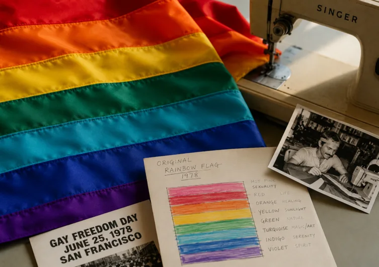
The original rainbow flag was created in 1978 by American artist and activist Gilbert Baker, who was asked to design a symbol for San Francisco’s growing LGBTQ+ community. Baker wanted something that could represent the diversity of the people it was intended to bring together.
The first version contained eight colours, each given its own meaning. Hot pink represented sexuality, red life, orange healing, yellow sunlight, green nature, turquoise magic and art, indigo serenity, and violet spirit.
The flag made its public debut during San Francisco’s Gay Freedom Day Parade in June 1978. It quickly became associated with the growing visibility of the LGBTQ+ movement, at a time when Pride was increasingly becoming a public expression of identity and political demands.
The eight-colour design, however, did not last long. Hot pink fabric was difficult to produce commercially, and turquoise was later removed when the flag was divided into two equal rows of colours for practical reasons. The six-colour version, red, orange, yellow, green, blue and violet, eventually became the design most widely recognised around the world.
Over the following decades, the rainbow flag became much more than a Pride decoration. It appeared at demonstrations, cultural events, businesses and homes, turning visibility itself into a form of expression.
Its meaning also evolved alongside the LGBTQ+ movement. In 2018, designer Daniel Quasar introduced the Progress Pride Flag, adding black, brown, light blue, pink and white stripes to highlight LGBTQ+ people of colour and the trans community, as well as people affected by HIV/AIDS and those who had been lost.
Other variations followed, reflecting the fact that LGBTQ+ communities are not a single, uniform group. The flag has continued to change because the community it represents has continued to grow and become more visible.
That may be the most enduring idea behind the rainbow flag. It was never simply designed to identify a group of people. It was created to celebrate difference, visibility and the possibility of belonging.
More than four decades after it first appeared on the streets of San Francisco, the rainbow remains one of the world’s most recognisable symbols of LGBTQ+ pride, a piece of design that became part of a movement, and eventually part of popular culture itself.